Add Interactivity to Your Embedded Analytics with Click Events
MongoDB Charts’ data visualizations can now become more interactive, so users and stakeholders can dive deeper into the insights they care more about. That’s possible with a new feature currently in beta with support for most Charts types: click events.
A click event in the Charts embedding SDK is simply a notification that a user clicked on a chart. That click could be anything: They might have clicked on a bar in a bar chart, a chart’s legend, or even empty white space within the chart. Web developers can subscribe to these events and create different functionality depending on where the user clicked.
Why might you want to enhance your app or embedded analytics workflow with click event data?
Click-event data opens up a wide range of possibilities. Here are a couple of examples, inspired by various Charts users who’ve been telling us how they’d like to use click-event data.
-
Open up another chart, based on a user clicking on data within a chart:
A logistics company has a bar chart that shows pending orders at an aggregate level per region, and they want to see more detail on pending orders for a specific region. They create a click event handler in their application that opens up a new chart with pending orders per supplier, based on the region selected in the aggregate chart. -
Filtering the other charts on a dashboard when a series or data point on a single chart is clicked:
A retail clothing company has a dashboard with various shopping cart information such as sales, orders processed, and returns, for their portfolio of products. The head of outerwear sales only wants to see data for the “outerwear” category of products, so they click on the “outerwear” series within a bar chart. The rest of the dashboard can adapt so that it shows only information relevant to outerwear.
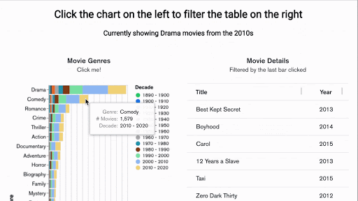
The example below is created from one of our sample data sets. We created two charts in a single app, tied to the sample movie data set that every Atlas user can access.
On the left is a stacked bar chart with category level data that includes genre and decade. On the right is a table chart that shows each individual movie within a category. Clicking on a specific category in the bar chart updates the movies shown in the table chart.
How can you get started with click events of embedded charts?
If you haven’t yet used the embedding SDK for MongoDB Charts, you’ll want to familiarize yourself with the docs, consider watching this video tutorial, and access the SDK via the Charts GitHub repository.
Regardless if you’re new to using the SDK or have experience with it, it’s important to note that you will need to use the @mongodb-js/charts-embed-dom@beta tagged version of the SDK to have access to the click events functionality while it’s in beta. There are two examples specifically for click events in the repository: click-events-basic and click-events-filtering.
If you just want to explore and test out the functionality, you can play around with them in the following sandboxes using codesandbox.io:
Here’s a snapshot of the data surfaced in a click event that is available for developers to use in their apps. In this example I clicked on the yellow section of the top bar in the Movie Genres chart above. Note how it includes details of the click coordinates, the type and role of the clicked mark, and the corresponding chart data for the mark.
{
	"chartId": "90a8fe84-dd27-4d53-a3fc-0e40392685dd",
	"event": {
		"type": "click",
		"altKey": false,
		"ctrlKey": false,
		"shiftKey": false,
		"metaKey": false,
		"offsetX": 383,
		"offsetY": 15,
		"clientX": 403,
		"clientY": 99,
		"pageX": 403,
		"pageY": 99,
		"screenX": 756,
		"screenY": 217
	},
	"data": {
		"y": {
			"label": "Genre",
			"value": "Drama"
		},
		"x": {
			"label": "# Movies",
			"value": 3255
		},
		"color": {
			"label": "Decade",
			"value": "2010 - 2020",
			"lowerBound": 2010,
			"upperBound": 2020
		}
	},
	"target": {
		"type": "rect",
		"role": "mark",
		"fill": "#F0D175"
	},
	"apiVersion": 1
}
Whether you’re an avid user or new to MongoDB Charts, we hope you consider taking advantage of the new click event capability to increase the interactivity of Charts. It’s in beta because there is more functionality still to come. It has yet to be released for a few chart types: geospatial, table, top item, word cloud, and number charts. On that note, we’d love to hear your thoughts through the MongoDB Feedback Engine.
If you haven’t tried Charts yet, you can get started for free by signing up for a MongoDB Atlas and deploying a free tier cluster.