Hands-on learning with the MongoDB Charts sample dashboard
MongoDB Charts now comes with a sample dashboard full of charts. This serves as a sandbox allowing all users, new and experienced, to find inspiration for visualizing their own data, breakdown pre-made charts, and see Charts’ capabilities without the need to upload their own data.
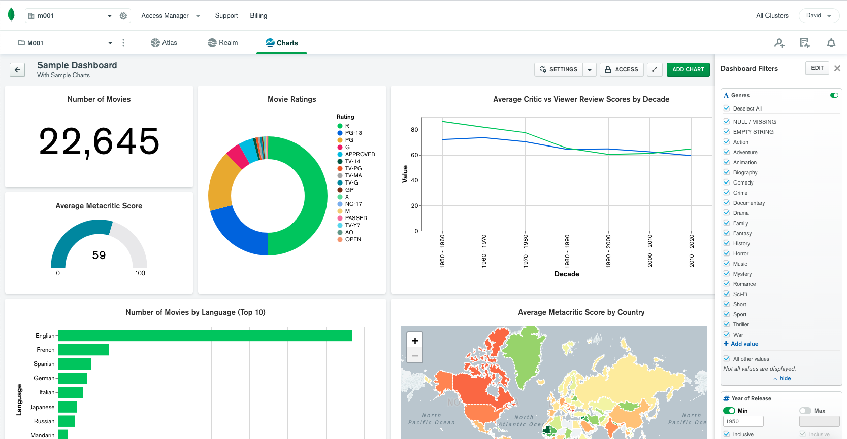
Whether you’re a newcomer to MongoDB or you’re already an avid user of Charts, the new MongoDB Charts sample dashboard has something for you, and it is now ready for you to explore! The sample dashboard includes 10 pre-made visualizations from a sample movie dataset, which you can access without needing to upload anything to your own cluster. The beauty in this dashboard is that you can quickly and easily see how various visualizations are made in Charts.
Creating the sample dashboard
You’re now able to quickly see various types of visualizations, filtering capabilities, and even make your own charts with sample movie data without the need to connect to a database or upload data. We’ve also simplified the process for getting started with Charts.
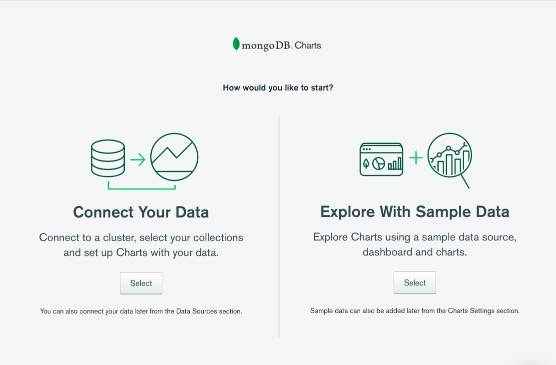
- If you’re new to Charts, you’ll see a welcome screen with two prompts upon launching Charts from MongoDB Atlas: Connect Your Data and Explore with Sample Data. Simply choose the second option and the sample dashboard will be ready and waiting.
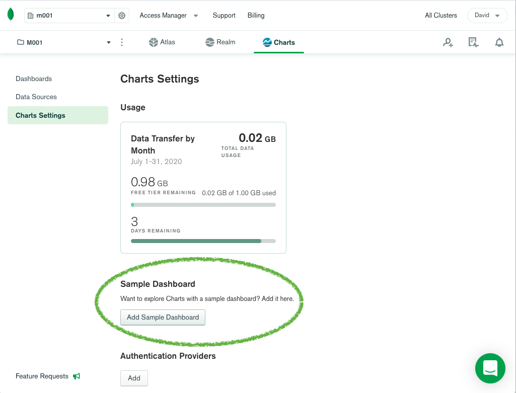
- If you’ve used Charts before, you’ll need to add the sample dashboard. You can do this with a single click from the Charts Settings menu. If you ever mess up or delete your sample dashboard, you can come back later and create a fresh one whenever you want.
Seeing “under the hood” of pre-made visualizations.
There are many ways to learn new tools. Documentation, video tutorials, and self-learning with a blank canvas (or dashboard in this case) are worthy options, and ways you can get started with Charts today. However, for some tinkerers, the best way to learn is to break down something that’s functioning — like a car engine, a computer, a script, etc. — and see how all the parts fit together. That’s exactly what the sample dashboard achieves.
If that’s the way you like to learn, here are some things to look out for when you click ‘Edit’ at the top right of each chart:
- The “Number of Movies” number chart at the top left shows the simplest possible chart — it simply counts the number of documents in the collection.
- The “Number of Movies by Language” bar chart shows how to unwind values from an array (in this case from the languages field) to plot them on a chart. This chart also uses the Limit Results feature to show just the top 10 results.
- The “Movie Duration vs Metacritic Score” heat map in the bottom right is a good example of how to visualize three dimensions. Not only do you see the metacritic score and average movie time, but how many films fall at the intersection of those two dimensions.
- The “Most Prolific Actors” bar chart looks simple but hides some advanced techniques. The tomatoes.critic.tomatoMeter field is actually a calculated field with a complex MQL expression used to calculate the series name.
- Try selecting and deselecting different filters in the Dashboard Filters pane. While filters are nothing new to Charts, the sample dashboard shows quickly how selecting/deselecting different attributes within filters will update all the visualizations on a dashboard.
Find inspiration for how to visualize your own data.
Even though the data you’re working with might differ quite a bit from movie data, the sample dashboard can still show you a glimpse of what’s possible with your own data. Here are a few ideas that might resonate with you:
- Think about how you might monitor performance metrics
- For example, look at the setup of the dashboard. The two top left charts are a total of movies in the collection and a gauge chart of the average metacritic movie rating. While the sample dataset is static, imagine if they were constantly updating as your database was being updated, for example showing customer registrations or sentiment score.
- Make your app or content more engaging with a visualization
- It might take a leap to think about which of the charts you might use in your app or webpage, but what if you worked for a movie review aggregation site. Immediately, several of the charts would become compelling to your target audience.
- Create insights that will drive business decisions
- I’m not in the business of making movies, and I presume you probably aren’t either. However, what if you are asked about the seasonality of your product, app or business — are there types of charts on the sample dashboard you might recreate with your own data to help answer that question? While the insights are seemingly endless, a quick glance at the dashboard could help answer how business is trending, how different regions are performing, who are the top customers/users, and the list goes on.