Uncover hidden truths with Interactive Filtering
Atlas Charts has been updated with greater dashboard interactivity! With Interactive Filtering, users can click on charts to highlight and filter their dashboard data to their heart’s content.
Interactive dashboards support better decision making
Data visualisations are meant to be more than just a pretty collection of charts. They are a valuable decision making tool. At MongoDB, we believe that users should not only be able to manipulate their data but explore the significance of data changes in their dashboards to aid in making faster decisions. Last year, we added the ability to interact with charts and dashboards using Dashboard Filtering.
This year, we are taking it to the next level. We are very excited to release ‘Interactive Filtering’, allowing users to interact with a particular chart to filter data in other charts.
How does Interactive Filtering work?
So let’s use an example to understand how this feature works:
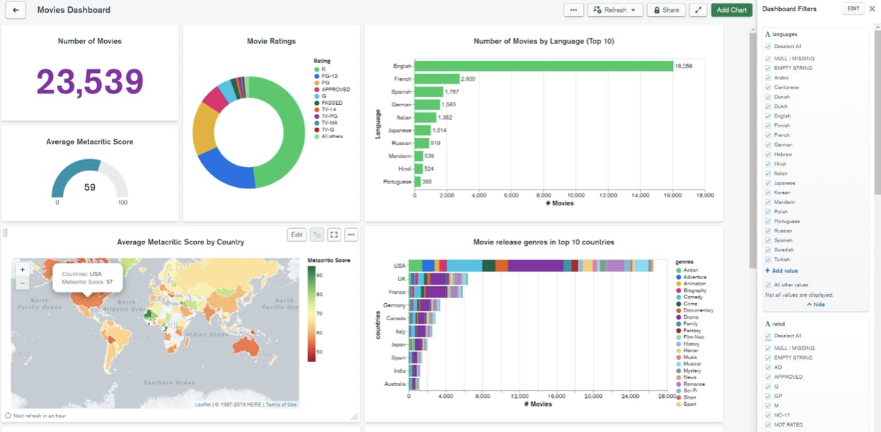
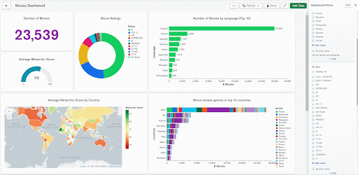
We have built a dashboard with multiple charts using the ‘Movies’ sample data source and added dashboard filters for the ‘languages’ and ‘rated’ fields. Previously, you could only interact with these filters by checking or unchecking options in the filter pane. While that option remains available, Interactive Filtering allows you to explore your data directly from the charts. So when you click on chart elements, such as bars, category labels or legend entries, it is a faster way to filter your dashboard. Chart elements are clickable if they are built with fields that are linked to dashboard filters. When filter fields are used on a chart’s category channels, we now highlight the requested data point but continue to show the other chart data, making it easy to see how the values compare.
Looking at the dashboard below, if you want to know how many Spanish movies are released or the average metacritic score of Spanish movies, then you can highlight ‘Spanish’ by clicking the ‘Spanish’ bar or the ‘Spanish’ label in the ‘Movies by Language’ chart. The other charts in the dashboard get filtered to show only data based on the Spanish language. You can also use the ‘languages’ dashboard filter to achieve the same result.
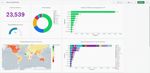
Interact by clicking directly in your dashboard
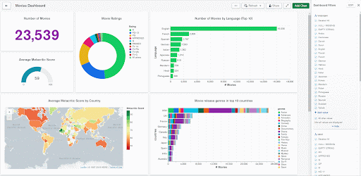
Interact by modifying your dashboard filters
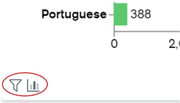
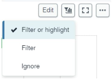
How do you know what Charts are highlighted vs filtered? We now show a handy filter and highlight icon to indicate whether a chart is being filtered, highlighted, or both.
What if you want to go back to the previous state before you started clicking? Simple, just click anywhere on the empty area of a chart and the changes are rolled back. If you were to use the dashboard filter pane to highlight or filter the dashboards, we save the state. Think of the dashboard filter pane changes as a persistent state and click changes on a chart as a temporary state.
Depending on the dashboard filters selected, you also have the option to make a chart in the dashboard filter or highlight, filter only or ignore the dashboard filters completely.
Try Interactive Filtering today
With ‘Interactive Filtering’ the possibilities to manipulate and explore your data are limitless. Try the new highlighting functionality today by creating dashboard filters for your key fields and uncover the hidden answers in your data.
New to Charts? You can start now for free by signing up for MongoDB Atlas, deploying a free tier cluster and activating Charts. Have an idea on how we can make MongoDB Charts better? Feel free to leave an idea at the MongoDB Feedback Engine.